

My goal is to design a brand that accurately describes who I am, but also feels professional enough for you to hire me for your next project.


The brand I’m building, I want to portray certain attributes. Dynamic, bold and fun. These brand attributes define how the brand looks, sounds and acts.
A solid logo is one of the most important investments a brand can make. When designing the perfect logo for me there was a ton to consider. The logo had to be simple and clear so it would be effective at all sizes. Next I wanted it to represent me. I’m a lover of bold and dynamic design and my logo should reflect this. Many iterations later, I came up with a design using my initials that shows movement and contrast.





In order to have a bold and dynamic brand to match my sick-as logo, a vivid, bright colour pallette was on the cards. Experimenting with all the colour combinations under the sun, I arrived at a mint, charcoal and white. Mint has a calming effect while being vibrant and energetic. Keeping with this, I avoided the use of a full black to keep things feeling softer and used a charcoal instead to create contrast.
Sashatilley.design had a previous website, but it wasn’t up to scratch. I was looking for a fresher aesthetic that properly represented what I stand for that drove me to make some tough decisions and align it to my new brand identity.
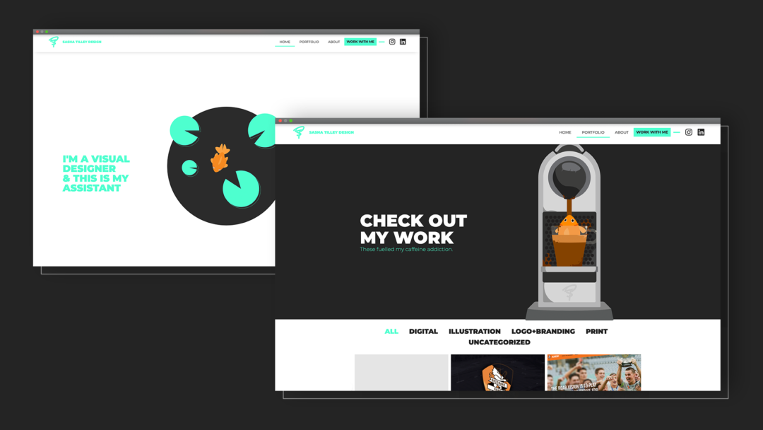

Here’s my personal assistant and junk-mail disposal unit, Om-Nom. Her job is to welcome guests as they enter my site and is represented through a simple but captivating animation to grab your attention and give you a little smile.
Om-Nom is a quirky motif used throughout the site to create a memorable and humorous experience while demonstrating my animation abilities.
The result is a cohesive brand linked together by clean but charming design and my core values.